
Why accessibility and usability go hand in hand.
We were standing outside a train station a few months ago, trying to confirm a meeting location before a phone battery gave up. The screen brightness was already at maximum. It didn't matter.
The confirmation button sat on a pale gray background. The text looked elegant indoors. Out there, under midday sunlight, it might as well have disappeared. Tilt the phone. Squint. Walk into the shade. Finally find the button.
Nothing was technically broken. The page loaded. Every feature worked. It just wasn't usable in that moment.
We've watched people hit the same wall in usability sessions. Sometimes it's a commuter outdoors. Sometimes it's someone sitting in a brightly lit office beside a window. Sometimes it's an older participant who quietly turns up the browser zoom before saying a word.
Different people. Different circumstances. The same point of friction.
Only later do most teams realize they're looking at more than an outdoor lighting problem. Low contrast — the sort covered by WCAG 1.4.3 (Contrast Minimum) — is also one of the most common barriers for people with low vision. What looked like an edge case in the parking lot turns out to be a daily reality for someone else.
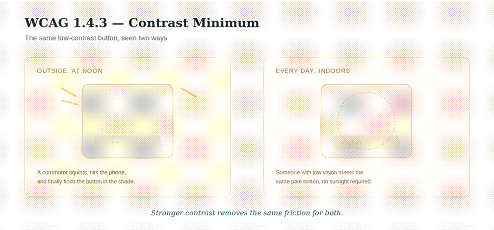
The same low-contrast button, seen two ways.
When the bus hits a bump
One usability session still sticks with us.
A participant was trying to dismiss a promotional banner before checking their account balance. The close icon was tiny — one of those minimalist little × buttons tucked into the corner.
Just as they reached for it, the bus they were riding lurched.
Miss. Tried again. Miss. Eventually they gave up and continued with the banner covering part of the screen.
Nobody in the room talked about accessibility afterward. The discussion focused on "mobile usability." Yet we'd seen almost the same interaction while testing with people who have motor impairments. Tremors. Reduced dexterity. Limited precision. The struggle looked remarkably familiar, except it wasn't caused by public transport.
WCAG 2.5.5 (Target Size) exists for a reason. Larger touch targets aren't simply more forgiving for someone whose hand is unsteady because the road is uneven. They're also more forgiving for someone whose hands are unsteady every day.
The screen doesn't know why the tap missed. It only knows that it did.
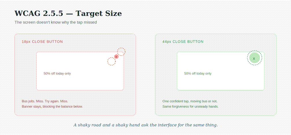
A shaky road and a shaky hand ask the interface for the same thing.
The same lesson has existed in the physical world for decades. Curb cuts were introduced so wheelchair users could navigate sidewalks independently. Before long, parents pushing strollers, travelers rolling suitcases, delivery workers with carts, and countless others were using the exact same piece of infrastructure without thinking twice about why it was there.
Digital products have their own curb cuts. We just don't always recognize them while we're building them.
Forms feel different at 5:30pm
Late in the afternoon, usability sessions tend to change. People are tired. Notifications keep appearing. Someone's attention is split between the task in front of them and everything happening around it. That's usually when complicated forms start falling apart.
Required fields aren't clearly labeled. Error messages appear only after submission. A red border silently announces that something went wrong without explaining what or where. Participants scroll up and down trying to locate the problem.
Jakob Nielsen's usability heuristic of error prevention has survived for decades because this pattern keeps repeating. People make mistakes. Interfaces should help them recover.
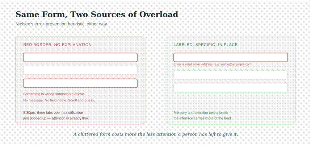
The same error-prevention heuristic, two sources of overload.
During accessibility testing, we see something very similar with participants who experience cognitive disabilities affecting memory, attention, or information processing. The interruptions are different, but the outcome often isn't. A cluttered interface increases cognitive effort whether the distraction comes from the environment or from the interface itself.
Clear instructions before someone starts typing. Specific error messages instead of mystery highlights. Breaking long forms into manageable sections. Those choices reduce the amount of work the interface asks people to do. They rarely benefit only one audience.
The video nobody could hear
You're halfway through a product demo while waiting in an airport. Boarding announcements echo overhead. You forgot your headphones. The video autoplays. Someone is explaining something important. You catch maybe every fourth word.
Captions suddenly become the feature you care about most.
This doesn't feel like an accessibility scenario at first. It feels like real life. Then you spend time testing with people who are Deaf or hard of hearing, and you realize the airport never really leaves — the challenge simply has a different cause.
One decision, five reasons it matters
Captions help in noisy cafés. They help during quiet commutes where audio would be rude. They help someone learning a second language. They help when search engines index spoken content. And, of course, they help the audience they were originally created for.
Why teams keep separating the work
We've rarely met a product team that intentionally wanted to make something difficult to use.
What we have seen is a familiar project timeline. Research happens first. Wireframes come next. Features are built. A usability test or two squeezes in before launch. Accessibility arrives near the end, often as an audit with a spreadsheet full of WCAG success criteria.
At that point, conversations shift from experience to compliance. Can we fix these issues before release? How many are blockers? Which ones are acceptable risk?
The separation isn't usually philosophical. It's procedural. Once accessibility becomes something evaluated after design decisions have already solidified, it naturally starts looking like a parallel stream of work instead of another lens on the same experience.
Designing for the moments people actually live in
The most useful design discussions rarely begin with disability categories. They begin with ordinary moments.
Someone checking directions in bright sunlight. Someone carrying groceries while unlocking a door with their phone. Someone rushing through a form after a stressful appointment. Someone watching a training video without headphones because everyone else in the office is already on calls.
The resulting design decisions aren't particularly dramatic. Buttons become easier to tap. Contrast becomes strong enough to survive daylight. Captions appear by default. Error messages explain what happened instead of relying on color alone.
None of those decisions feel especially niche while you're making them. They simply remove friction before someone has to fight through it.
Looking at the same screen differently
We still think about that screen outside the train station.
Indoors, during design reviews, nobody noticed the contrast. Under perfect lighting, it looked polished. Minimal. Clean. Out in the sun, the interface quietly asked us to work harder than it should have.
The interesting part wasn't eventually finding the button. It was realizing how many people meet that same screen under different conditions every single day. Some because they're standing outside. Some because of low vision. Others because they're tired, distracted, juggling a child, riding a bus, or trying to hear a video over the noise of everyday life.
The interface never knows which story brought someone there. It only reveals whether it made the task easier — or harder.