
The most frequent barriers we find across websites and applications.
After enough audits, you stop being surprised by what breaks. You start being surprised by how often it's the exact same thing.
Different industries. Different tech stacks. Different budgets, different design systems, different teams who've never worked together. And still, session after session, the barriers that actually stop someone from finishing a task come from a fairly short, repeatable list.
That's not really a criticism of any one team. It's what happens when the same handful of small decisions get made the same way, over and over, by developers and designers who were never specifically taught to think about a screen reader user, or someone who can't operate a mouse, or someone reading a page at 400% zoom. The patterns aren't random. They're just common.
What follows is that list, the issues that show up on nearly every engagement, roughly in the order we tend to run into them.
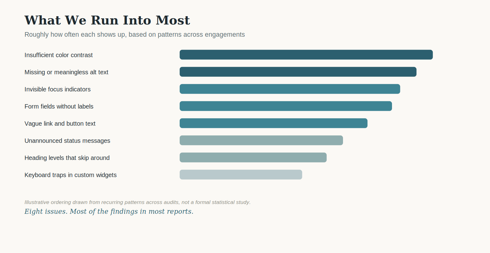
Eight issues. Most of the findings in most reports.
1. Missing or meaningless alt text
This one usually turns up on the very first page.
Sometimes the alt attribute is missing outright. More often, it's technically there and says almost nothing — alt="image-final-v2.jpg", or a product photo described as "image of a bag" on an ecommerce page where a customer actually needs to know the color and style. WCAG 1.1.1 gets logged either way, but the second version is sneakier, because it passes an automated scan while still telling a screen reader user nothing useful.
A lot of this traces back to CMS defaults and stock image libraries that auto-populate alt text from a filename. Nobody sat down and decided to skip it; the platform just never asked anyone to write something better.
The trickiest version of this issue isn't the empty one — it's the alt text that's technically accurate but functionally useless. A chart described as "bar chart" instead of what the bars actually show. An icon-only button described as "icon" instead of what it does. The screen reader user hears something, which can be worse than hearing nothing, because it creates the impression that the information was conveyed when it wasn't.
2. Invisible focus indicators
One mistake we see constantly: a design system strips the browser's default focus outline with a plain outline: none, somewhere in a global CSS reset, and nobody replaces it with anything else.
Sighted mouse users never notice, because they never needed the outline in the first place. A keyboard user tabbing through the same page has no idea where they are. WCAG 2.4.7 covers this directly, and it's one of the fastest checks in any audit — tab through the page once, and the absence is usually obvious within the first few seconds.
What makes it worse is how often it hides in plain sight during a design review. A designer clicking through a prototype with a mouse has no reason to ever trigger a focus state, so it can sail through months of reviews without a single person seeing that it's missing. It's rarely caught until someone specifically puts the mouse down.
3. Insufficient color contrast
This is the single most frequently logged finding across almost every industry we test, and it rarely comes from one dramatic mistake. It's usually something like placeholder text doing double duty as a label, styled in a pale gray that looks fine to a designer working on a calibrated monitor and disappears for a lot of other people.
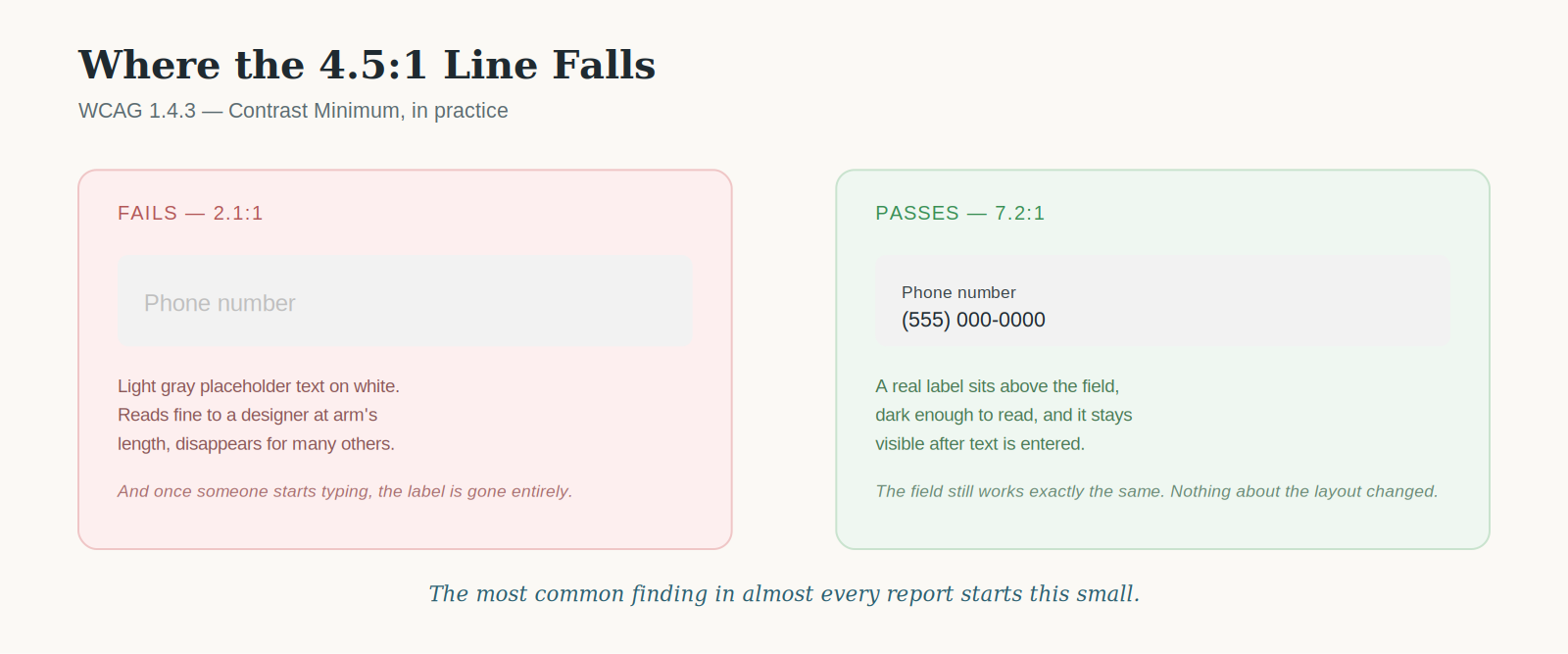
The most common finding in almost every report starts this small.
The WCAG 1.4.3 threshold is 4.5:1 for normal text and 3:1 for large text and UI components, and the fix is almost never a redesign — usually just a few shades darker, with the layout completely untouched.
4. Form fields without programmatic labels
A field can look perfectly labeled and still tell a screen reader nothing, because a placeholder attribute isn't a label. It disappears the moment someone starts typing, and depending on the markup, it may never get announced at all.
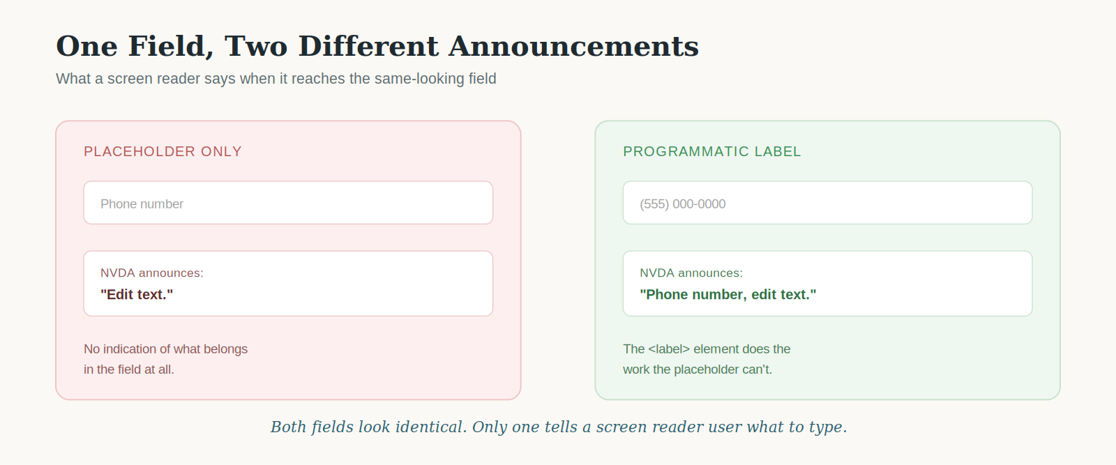
Same field, two very different announcements.
WCAG 1.3.1 and 4.1.2 both come into play here. The fix is a real <label> element tied to the input through for and id, usually a handful of lines of markup, not a redesign of the form.
5. Keyboard traps in custom widgets
Custom components are where this shows up most — a date picker, a multi-select dropdown, a "back to top" widget that grabs focus on scroll and never lets go of it cleanly. Someone tabs in, and there's no way to tab back out without refreshing the page.
WCAG 2.1.2 exists specifically for this. In our experience it's rarely intentional; it's almost always a side effect of a focus-trapping library configured for a modal and then reused somewhere it doesn't actually belong.
We've watched this happen with a component that was built correctly the first time — a modal with a proper focus trap, released and returned on close, exactly as it should work. Six months later, someone reused the same trapping logic on a slide-out filter panel that didn't have an obvious close action, and the trap that used to be a feature became a dead end.
6. Heading structure that skips levels
Headings tend to get picked for how they look, not what they mean. A section title "looks right" as an H4 because that's the font size the designer wants, so that's the tag a developer reaches for, regardless of what came before it in the outline.
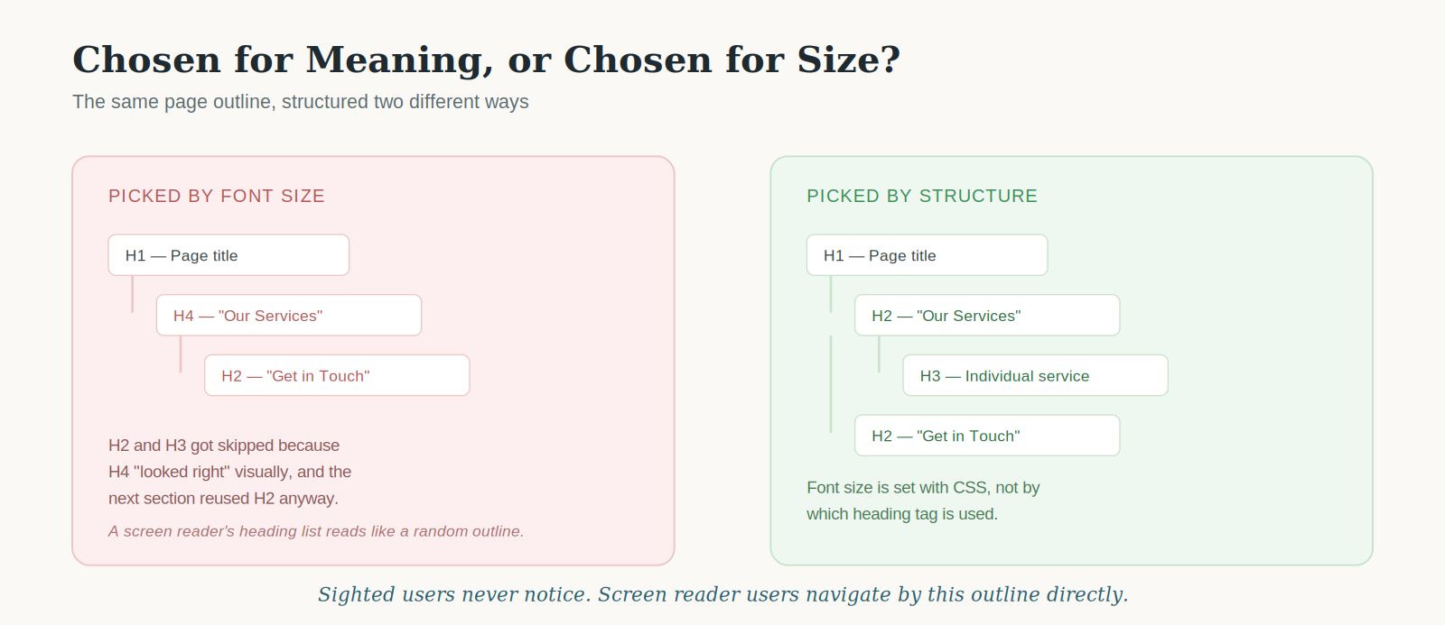
Chosen for meaning, or chosen for size?
Sighted users never notice, because visually the page still makes sense. A screen reader user navigating by heading list — a genuinely common way to skim a page — gets a structure that doesn't map to anything logical. WCAG 1.3.1 and 2.4.6 both apply, and the fix is almost always just picking the correct tag and using CSS to control how it looks, instead of letting the visual size drive the markup.
7. Status messages and dynamic updates that go unannounced
A cart count updates after "Add to Cart." A search results count changes after a filter is applied. A save confirmation flashes and fades. All of it happens silently for anyone not looking directly at that exact spot on the screen at that exact moment.
This is WCAG 4.1.3 territory, and it's one of the harder ones to catch without actually running a screen reader, because there's no visual sign anything is wrong. The page looks like it's working. It's simply not saying anything out loud.
The fix is usually small — an aria-live region around the message container, set to polite for routine updates or assertive for anything urgent, like a session timeout warning. The hard part isn't writing that one line. It's remembering to check for it on every new dynamic feature a team ships afterward, because this is exactly the kind of issue that creeps back in with the next release if it isn't part of a team's normal QA pass.
8. Vague link and button text
A resources page with six "Learn more" links, all identical, is a common find. Visually, context makes each one clear — it's obviously attached to the card above it. Out of context, which is exactly how screen reader users often browse links on a page, all six say the same thing and none of them say what they lead to.
WCAG 2.4.4 asks for link text that makes sense on its own. "Learn more about our enterprise plan" costs nothing extra to write and solves the problem completely.
Why the list doesn't change much
Part of the reason these eight repeat so consistently is that accessibility problems scale the same way design systems do. A component built once and reused across two hundred pages doesn't create two hundred separate bugs — it creates one bug, replicated two hundred times, usually before anyone runs an audit against it.
Fix it once, fix it everywhere
This is exactly why we push clients to fix issues at the component level instead of chasing individual instances page by page. Relabeling one input field fixes one field. Fixing the shared input component fixes every form built from it, including the ones nobody's gotten around to auditing yet.
It also explains why the same eight issues show up whether the product is three years old or three months old. A brand-new build using a modern framework isn't automatically safer — it just inherits whatever assumptions were baked into its component library or its design tokens from day one, good or bad.
What this means for a roadmap
None of these eight issues are exotic. None of them require a redesign. Most come down to a missing attribute, a stripped style, or a tag chosen for the wrong reason, which is, honestly, good news. It means the fixes are usually cheap once someone actually knows to look for them.
The harder part is catching them before launch instead of after a customer, a procurement reviewer, or a legal complaint catches them first. That's the gap manual testing is built to close — not because automation is unreliable, but because most of this list is exactly the kind of thing a scanner walks right past without ever noticing.
Our audits are built around that list on purpose. It's not because every product is broken in the same way — it's because a short, well-understood list of recurring issues is a lot easier to design around than an open-ended one.