
The difference between passing a scan and serving a user.
A QA engineer we worked with once walked into a release meeting looking relieved.
The accessibility dashboard was clean. axe DevTools had passed. Lighthouse had given the page a respectable score. A few missing labels had been fixed the week before, color contrast issues were gone, and everyone around the table felt comfortable signing off.
Later that afternoon, we invited an NVDA user to walk through the checkout flow.
They never made it to the payment page.
Nothing had technically "broken." The buttons were there. The forms had labels. The automated report still showed green. But the keyboard focus jumped unpredictably between sections, the promotional sidebar interrupted the reading flow, and after selecting a shipping option, the screen reader never announced that anything had changed. The user kept wondering whether the selection had actually been saved.
That meeting changed the way the team talked about accessibility. Not because the automated tools had failed — they had done exactly what they were designed to do — but because everyone suddenly understood there was another layer that no dashboard had measured.
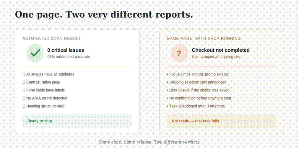
The same page, two very different verdicts.
What automated accessibility testing does remarkably well
Automated testing deserves a lot of credit.
If we're setting up a new project, one of the first things we usually add is an accessibility scanner to the development workflow. Whether that's axe DevTools, Lighthouse, WAVE, or automated axe-core checks running inside CI/CD, they catch problems quickly and consistently.
Those tools excel at finding issues that can be identified directly from the DOM or page structure. They'll reliably flag things like missing form labels (WCAG 1.3.1, 3.3.2), images without alternative text (WCAG 1.1.1), color contrast failures (WCAG 1.4.3), invalid or conflicting ARIA attributes, empty buttons or links without accessible names, and duplicate IDs or structural markup problems.
The beauty is scale. A scanner can evaluate hundreds of pages in minutes. Every pull request can be checked before it reaches production. Developers get immediate feedback instead of discovering problems weeks later during an audit.
The accessibility community often references that automated testing typically identifies only around 30–40% of WCAG issues. The exact percentage varies depending on the application and testing method, but the broader point has remained consistent for years: automated tools are excellent at detecting machine-detectable patterns. Many accessibility requirements simply aren't machine-detectable.
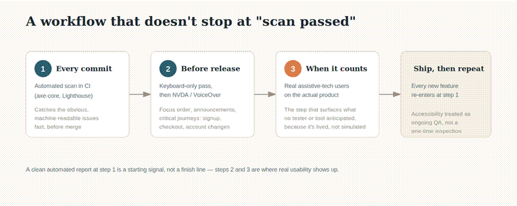
What a scan can confirm versus what only a person can confirm.
The problems code can't fully describe
A few years ago, we reviewed a registration form that looked almost perfect on paper. Every input had a label. Every field passed automated validation. No ARIA errors. No contrast issues. The scanner found nothing worth mentioning.
Then we tried completing the form using only a keyboard.
The focus order wandered across the page like someone shuffling a deck of cards. After entering the first name, focus skipped into a newsletter section, then jumped back to the address fields before eventually reaching the submit button. Nothing violated the HTML syntax. Nothing triggered an automated rule. But completing the form felt confusing because the experience itself lacked logic.
That's the important distinction. Automation evaluates patterns in code. Humans experience interaction.
The same thing happens with alternative text. An automated tool can tell whether an image has an alt attribute. It cannot tell whether alt="image1.png" communicates anything useful to someone who cannot see the image. We've seen decorative icons described in unnecessary detail while critical product diagrams received descriptions so vague they might as well have been empty. Technically compliant. Practically useless.
Reading order presents another challenge. A screen reader doesn't care how beautiful a page looks visually if the underlying semantic order causes headings, navigation, advertisements, and main content to be announced in a confusing sequence.
What happens when a real person enters the picture
One of our favorite parts of accessibility work is sitting beside someone using assistive technology. Not because they're there to "test." They're there to use the product. There's an important difference.
We remember watching a VoiceOver user navigate an airline booking flow that had already passed multiple automated scans. They reached the date picker. The calendar opened. Nothing announced that it had opened. Arrow keys behaved differently than expected. Focus disappeared inside the widget after selecting a date, leaving the user unsure where they were.
After several attempts they stopped, smiled politely, and asked, "Can we try another way?"
No automated report had described that experience. Watching it unfold took less than three minutes.
Manual testing uncovers questions that software cannot answer on its own. Can someone understand what this button actually does? Does the focus move where users naturally expect? Does a screen reader announce success messages clearly? Can someone recover after making a mistake?
Human testing has limits too
None of this makes manual testing effortless. Quite the opposite. It takes time.
Experienced accessibility testers are difficult to replace with a script, and comprehensive audits can become expensive for large applications. Manual reviews aren't particularly good at repetitive verification either — nobody wants to click through 600 nearly identical pages just to confirm every image has meaningful alternative text when automation can immediately highlight the obvious omissions.
That's exactly why experienced teams rarely frame the conversation as automation versus manual review. Each solves a different problem.
What the healthiest accessibility workflows actually look like
The teams we've seen succeed treat accessibility more like quality assurance than a final inspection.
Automated checks run continuously. Developers receive feedback while writing code rather than months later. Before significant releases, manual testing begins — keyboard-only navigation first, then screen reader testing with tools like NVDA on Windows or VoiceOver on macOS. Critical user journeys — sign up, log in, checkout, booking, account management — receive focused attention because those are the moments where small interaction problems become real barriers.
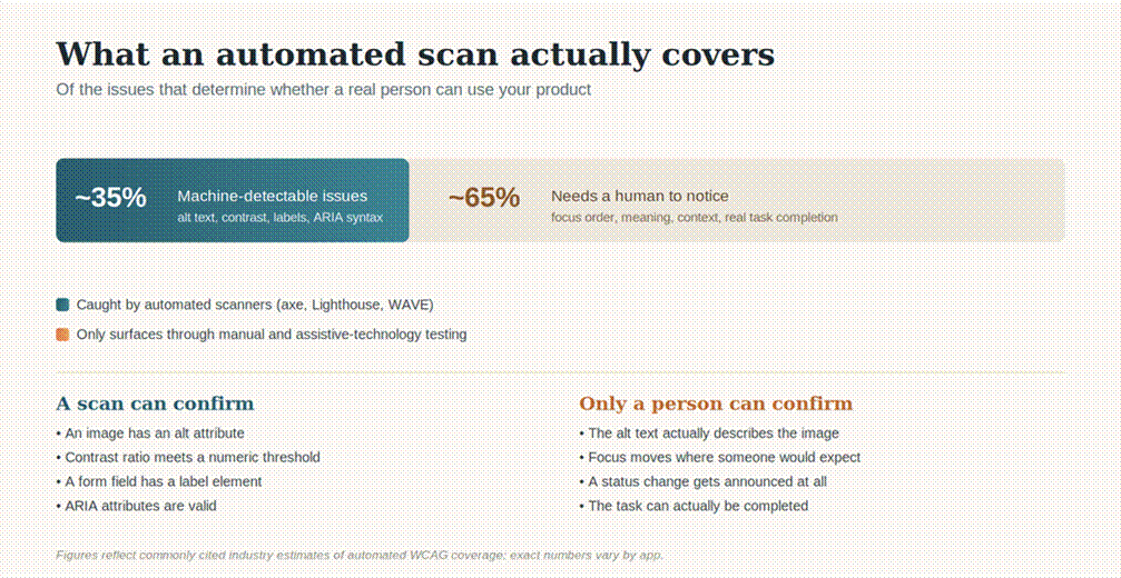
Automated checks open the door; manual and real-user testing decide whether anyone can walk through it.
When possible, involving people who actually use assistive technology changes the conversation yet again. We've watched product teams spend days debating whether a workflow was "accessible enough," only for a blind participant to identify the real friction point within minutes — not because they knew the WCAG documentation better, but because they navigated the interface differently from the people who built it.
The dashboard didn't change — the experience did
After watching a checkout journey fail with NVDA, one team adjusted the focus order, announced status changes correctly, simplified the navigation sequence, and invited the same participant back a week later. This time, the purchase was completed without assistance. The automated report looked almost identical to the week before. The experience didn't.